British Council

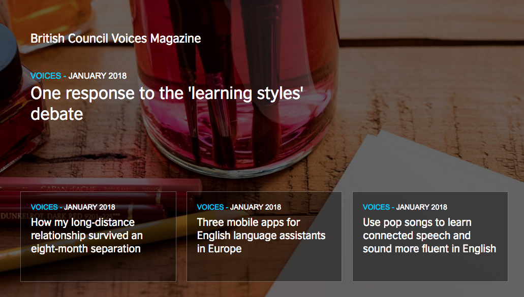
The website provides greate resources and information, but their interface has a lot of room for improvement. For example, their main navigation bar does not have any indicatior for hovering. Also, as an organization aiming to helpe people learning English, I would think they should provide an easy access way of changing the page to other langauges. On top of that, their "About us" link is in the footer of their page, but I was expecting it to be part of the main navigation bar on top. However, I think the opaque dark layer over a picture is very successful, but i would use the brightness of the picture as a hover interaction.

